Canadian
We would like to share the following entries for the CCA 2020 student map competitions.
Winners will be announced at the upcoming AGM in September.
CCA 2020 Student Map Competition: President’s Prize Entries
The CCA President’s Prize recognizes excellence in student map design and production and is open to all students at Canadian post-secondary institutions who have completed and produced a cartographic project in the preceding school year. The President’s Prize Competition consists of college-level or CEGEP student entries, and University-level student entries.
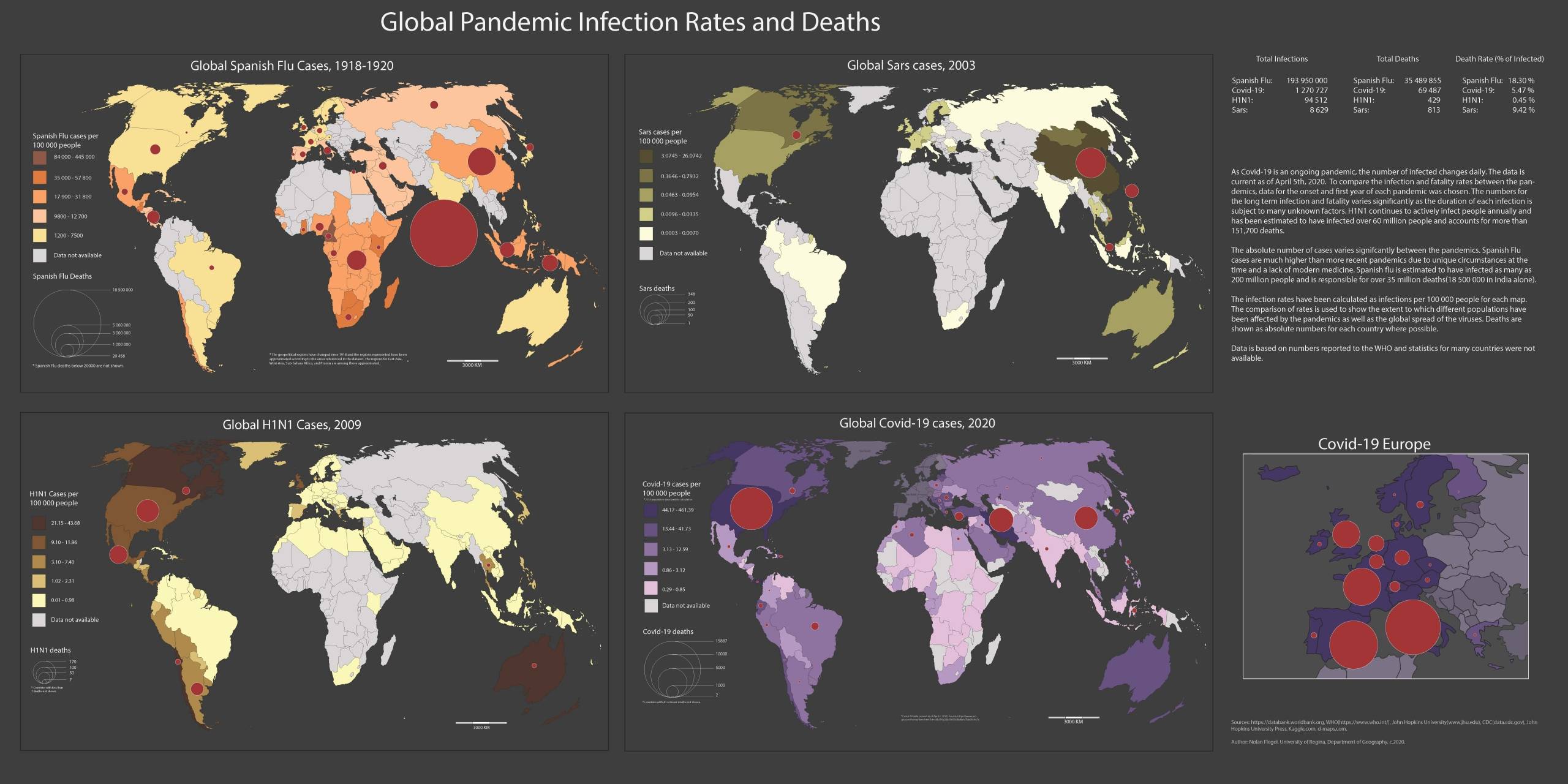
Global Pandemic Infection Rates and Deaths
Nolan Flegel, University of Regina
Design Objectives: The design objective was to create a thematic map using no less than three thematic variables. Without knowing the extent to which Covid-19 would disrupt the world, the topic was chosen as the pandemic was still emerging early in the semester.
I chose to examine the infection and mortality rates for previous pandemics, namely H1N1, SARS, and the Spanish flu. Since Covid-19 is ongoing and not matured, the data selected for each comparison was limited to the year in which the pandemic emerged. My goal was to visually illustrate the extent of each pandemic and allow easy comparison, using a side by side comparison to show the overall global impact. I wanted to show which regions or countries were affected and the overall severity to which the regions or countries had been affected. I also wanted to compare the mortality rates between the different pandemics as well as their overall infection rates.
The data was normalized to per capita where population statistics were available for the years in which the pandemics occurred. Infection rates per country are shown as a choropleth base map and mortality numbers are shown in absolute values as proportional symbols for each country. A comparison infection and mortality rates are shown as a table beside the inset maps. The main color schemes of Red and Black were selected as these colors are often associated with Severity, Emergency and Death.
The colors for the choropleth maps were selected to show contrast against the proportional symbols while still being distinct for each pandemic while still representing disease (green, brown, yellow, purple). An inset map was used for Covid-19 for Europe as this was the early epicenter and the data could not be easily displayed.
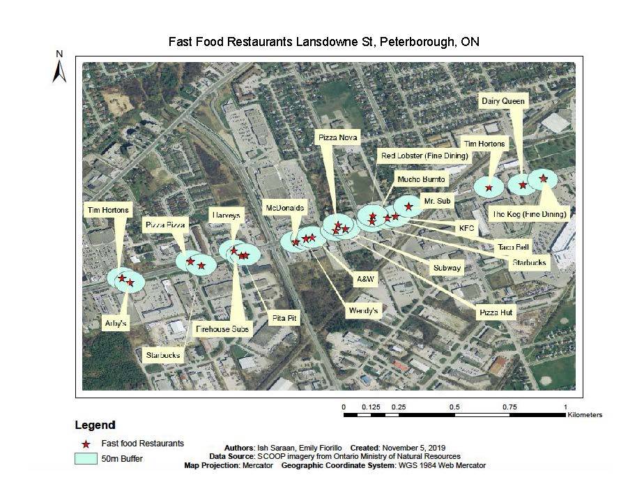
Fast Food Restaurants Lansdowne Street, Peterborough, ON
Emily Fiorillo, and Ish Saraan, Brock University
Design Objectives: In planning courses at Brock University, we learned that the fast food industry is rapidly growing causing numerous health issues and that there are no planning interventions being made to decrease the number of fast food restaurants in a neighborhood.
The objective of our map was to display that the growing number of fast food industry is a major issue in Canada. We went to Peterborough and chose a street (Lansdowne St) and collected GPS points on a Garmin each time we came across a fast food restaurant on that street.
After collecting our data points and inputting them onto ArcMap, it was evident that the points were close to one another. We put a 50m buffer around our points to show how close the fast food restaurants are and many of the buffers are overlapping displaying a lack of planning policies to limit the number of fast food restaurants in Peterborough. The labels have each name of the restaurant on them to show the variety of different fast food chain restaurants.
Within our study area we collected 23 points for fast food restaurants and two points for fine dining. The goal of the study was to show how fast food restaurants are usually densely located in an area, and the easy availability of a lot of fast food restaurants prompts the local population to make unhealthy eating choices.
Planning interventions can help restrict the number of fast food restaurants in an area in order to lessen the unhealthy eating options for the local population.
Debruin Cattle Drive
Kelly Pratt, University of Northern British Columbia
Design Objectives: The objective of this map was to tell the story of my family’s cattle drive that took place on horseback in late 2019.
In order to obtain this objective, the GPS track of the actual route is a bright, unnatural colour to ensure it stands out visually. A similar choice was made with the boundary of the summer pasture to make it clear where the cattle started their journey.
The area is a relatively small region and is incredibly nondescript, so it was important to provide both context and visual interest. Context was achieved by labelling distances and general directions to the nearest towns along with the inset map.
Visual interest was accomplished in two ways. First, the hillshade layer was exaggerated 5x to add texture to the background. Second, an image added from the actual event gives the observer an idea of what the day and region looked like.
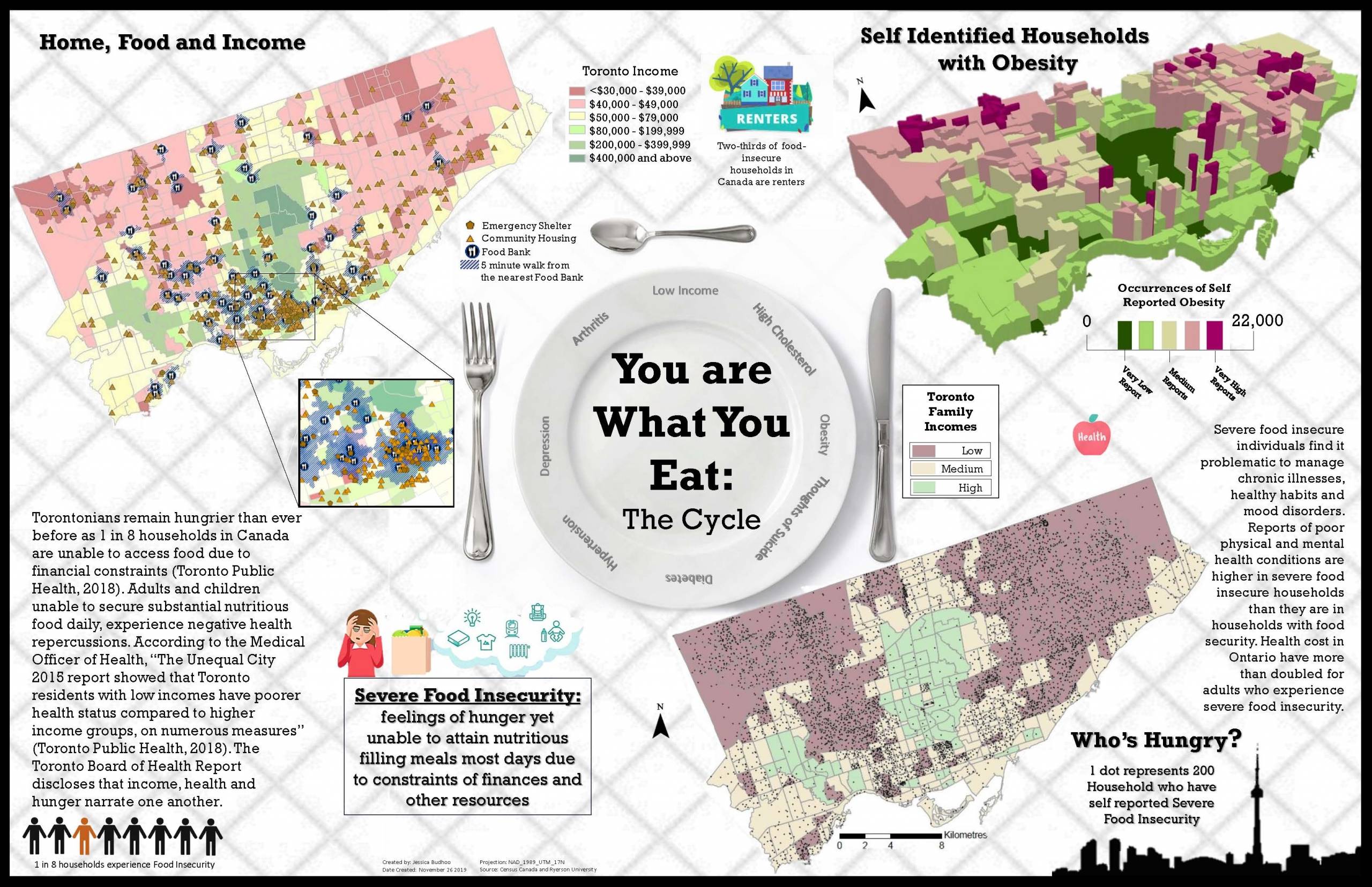
You are What you eat: the Cycle
Jessica Budhoo, Ryerson University
Design Objectives:
Torontonians remain hungry than ever before as 1 in 8 Canadian households are unable to access food due to financial constraints (Toronto Public Health, 2018). Adults and children unable to secure substantial nutritious food daily experience negative health repercussions. According to the Medical Officer of Health, “The Unequal City 2015 report showed that Toronto residents with low incomes have poorer health status compared to higher income groups, on numerous measures” (Toronto Public Health, 2018).
The Toronto Board of Health Report discloses that income, health and hunger narrate one another. Low income, hunger and poor health is a cycle that is difficult to break without the help of outside intervention. The purpose of the proposed map poster is to illustrate low income areas in the city of Toronto that are vulnerable when it comes to health and hunger.
The poster exposes the most susceptible demographic areas in Toronto, chart families that report hunger and classify the poorest health populations in Toronto. Data is sourced from the City of Toronto Database, Public Health Toronto as well web scraping for locations and address information.
Data used includes income levels by census tract, addresses for public housing, community housing and locations of food banks. From this data, three maps are produced to reinforce the relationship between income, food and health. The limitation of this poster is that only three relationships are being connected. The research suggests lack of food security in Toronto’s low-income areas has other associations such as; impact on social policies, food procurement, food skills, social assistance and spending patterns (Proof Food Insecurity Policy Research, n.d.). As well, food insecurity data is from 2012 seeing as Ontario has opted out on several Census Surveys.
To keep the poster streamlined, informative and impactful, all maps, for this poster will be used to strengthen the relationship of low income, poor health, and hunger. Taking into consideration the physical size of the poster, the map poster will have the appearance of a placemat. A picture of a plate will be used as a background to parallel the idea of a cycle.
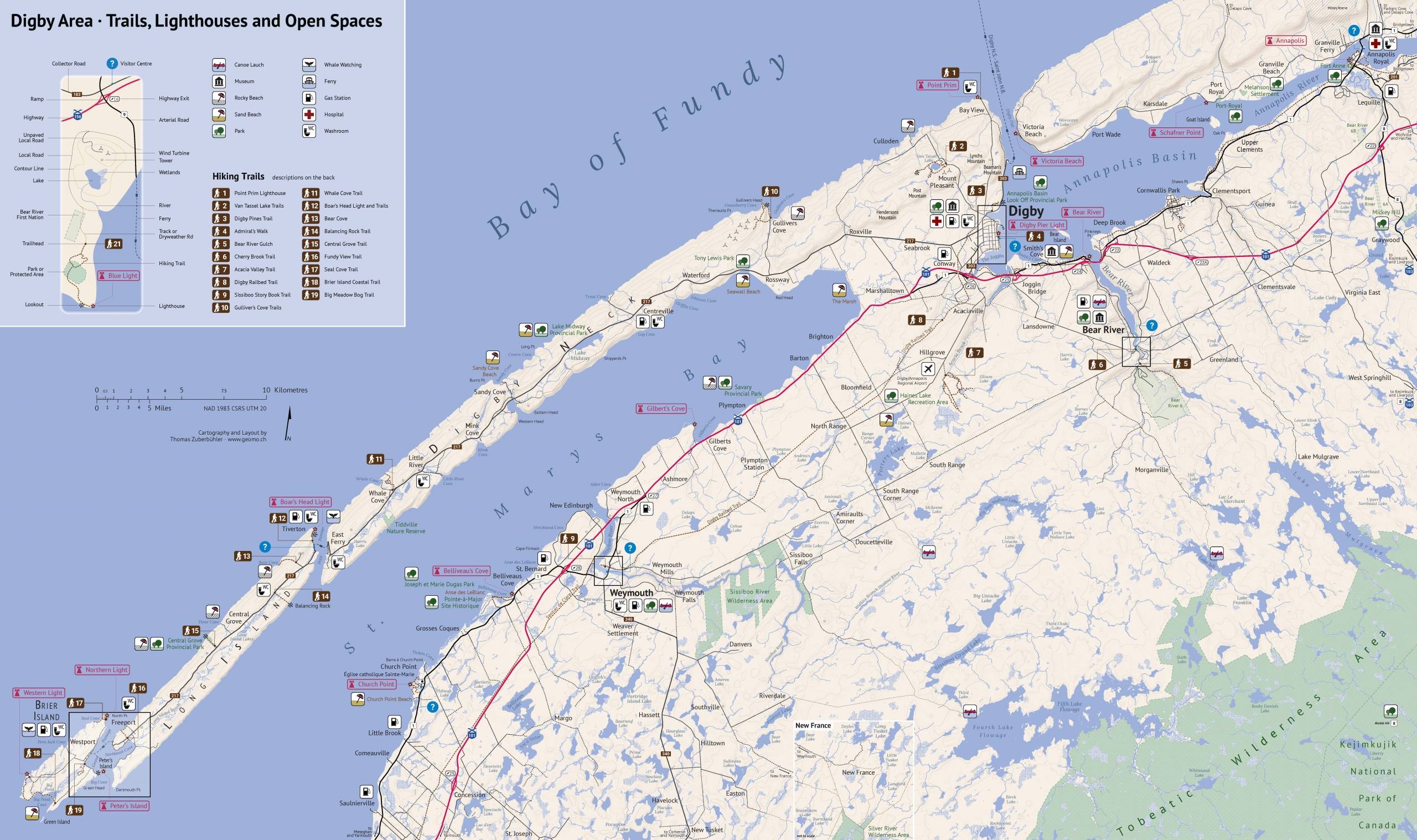
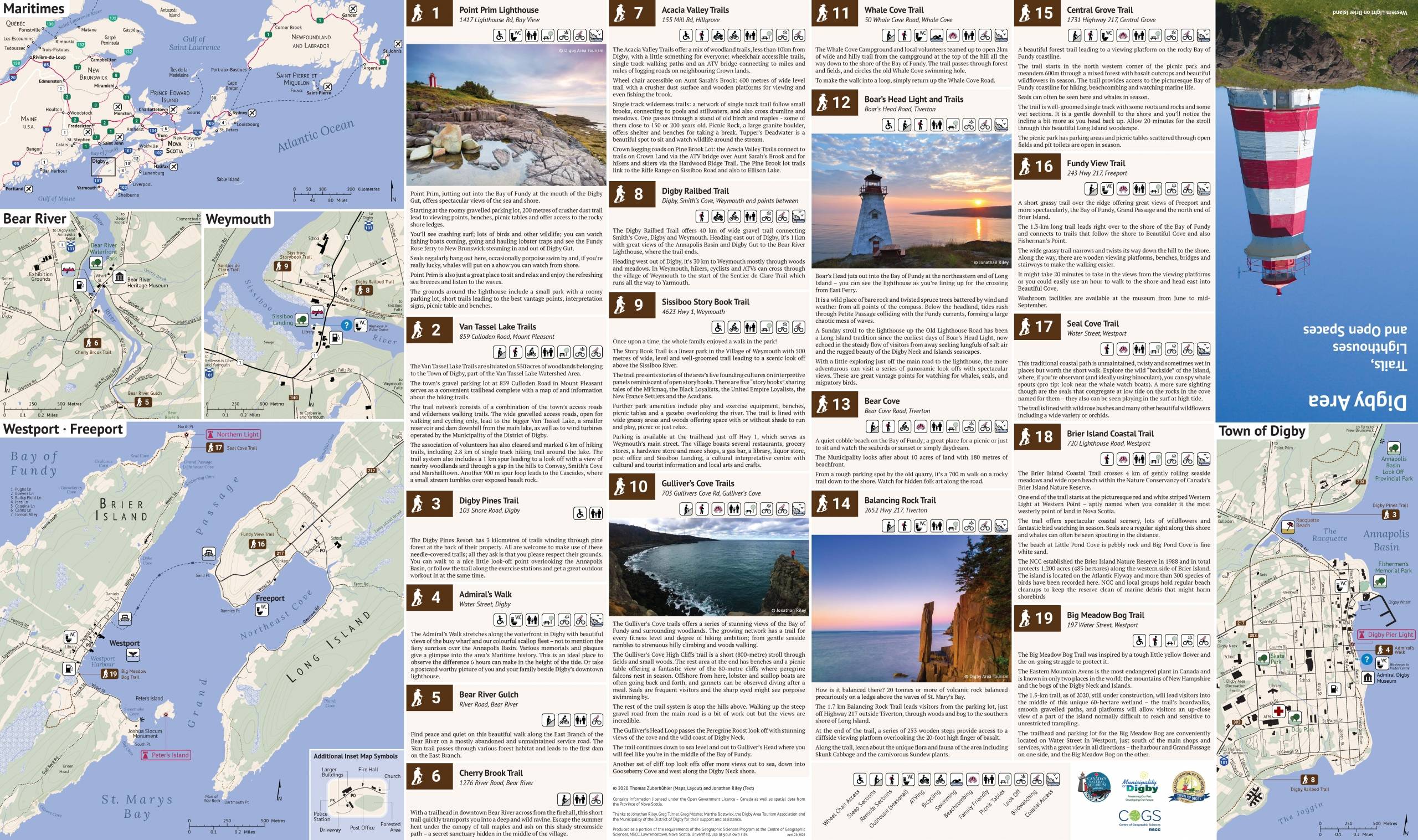
Digby Area · Trails, Lighthouses and Open Spaces
Thomas Zuberbuehler, Centre of Geographic Sciences
Design Objectives:
Presented map uses a simple design.
Some colours such as for water features, parks and forested areas are related with the colours of a Swisstopo map. In addition, a burgundy-like colour and brown were used. They harmonize well with the other colours. For labelling, the fonts PT Sans, PT Sans Narrow and Lora are used. Lora was chosen for its subtle cursiveness of its italic font style. However, PT Sans’ and Lora’s digit 1 has a serif which did not look well in map shields. Therefore, the font Roboto is (solely) used for numbers.
There are three main features, hiking trails, lighthouses and other tourist features such as parks, whale watching, canoe launching, beaches, washrooms and other facilities. A brown colour (earth) is used for the hiking trail labels and a burgundy-like colour for the lighthouse labels. Lighthouse labels are not filled in order to not appear more prominent than hiking trails.
All other features use classic icons. Most of those icons should be familiar to most map readers. However, this map is using a gender neutral washroom icon at the request of the client. After some research it was obvious that only a toilet or the lettering WC is commonly accepted to use by the community. However, using a toilet seat makes the icon too prominent whereas using the lettering WC is not well-known in North America. Therefore, a combination is used.
The map is inclined by 8 degrees so that Brier Island and Annapolis Royal fit on the map sheet. Although Annapolis Royal is located in another county, it is important for a map reader’s orientation because of its highway exit 22 which connects Digby with the south shore of Nova Scotia and the national park. There are four inset maps and one access map. All inset maps are inclined by 8 degrees as well to be consistent and also have the inset boxes on the main map parallel to the margin.
Due to their larger scale, the inset maps show additional features such as forested areas and larger buildings. There is one smaller scale access map for New France to overcome the fact that the dry weather road connecting New France with the rest of the map is just outside of the paper’s margin. The folding concept is similar to the 2015 Highway Map of PEI. The inset maps were placed in a way so that the user can access them quickly with only two unfolding steps.
There is also an overview map of the Canadian Maritimes which provides essential information on how to come to Digby. The trail descriptions are accompanied by additional icons to provide a quick overview for the map reader.
CCA 2020 Student Map Competition: CCA Web Map Award Entries
The CCA Web Map award recognizes excellence in online mapping and is open to all post-secondary students who have completed and produced a web map in the preceding school year. The CCA Web Map Award Competition consists of two levels, one for entries from either College-level, CEGEP students, and one for entries from University-level students.
Canada’s Electric Highway Network
Brooke Hehr, University of Alberta
Design Objectives: This project aimed to appropriately place coast-to-coast Level 3 electric vehicle (EV) charging stations in Canada to fulfill the requirements of Natural Resource Canada’s (NRCan) Electric Vehicle and Alternative Fuel Infrastructure Deployment Initiative.
Utilizing ArcGIS Desktop and ArcGIS Pro Closest Facilities and Origin-Destination Cost Matrix solvers available through the Network Analyst extension, 52 new locations for Level 3 EV charging stations are proposed with a focus on mid-west and northern Canada, as well as Newfoundland and Labrador.
Stations were placed at existing gasoline stations and are at most 200 km apart along the cross-Canada main corridor and are no more than 275 km apart in remote locations. Level 3 available (operational) and planned (in construction phase) EV charging stations available from NRCan are included.
Story Map Link: https://storymaps.arcgis.com/stories/94d0b8bd38d949388ae60fc2516ae6ce
Web Map Link: https://arcg.is/1rW181


