The Story Behind the CCA Logo
The Story Behind the CCA Logo
Did you know that past editions of Cartouche include many interesting articles and often details about the history of the CCA?
Previous versions of Cartouche are available online for members to download. We encourage members to check these out and learn a little more about your association. The article included below was originally published in Cartouche #60 (Winter 2005) by Dr. Henry Castner (CCA President 1981-1982) and explains the story behind the design of the CCA logo.

The CCA Logo (Dr. Henry Castner)
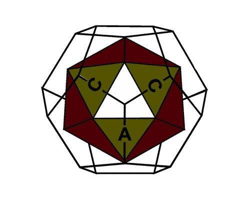
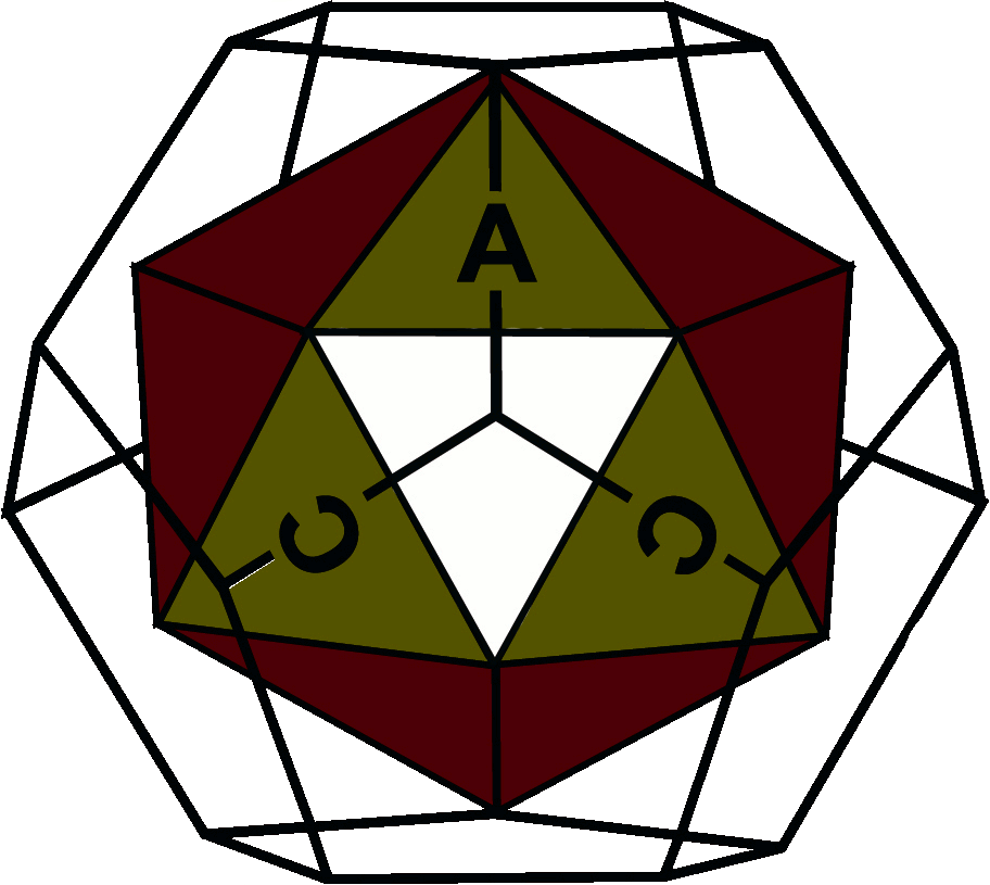
Physically, the CCA logo is made up of a regular icosahedron, a solid figure consisting of 20 equilateral triangles of the same size, within a regular dodecahedron, a solid comprised of 12 equal sided pentagons. These are 2 of the 5 possible regular polyhedrons having congruent faces or facets, each a regular polygon, which meet at equal angles.
The 5 regular polyhedrons are also known as the Platonic solids, even though they were known to the Greeks before the time of Plato. The other 3 solids, which are less reminiscent of a globe, are the tetrahedron (with 4 equilateral triangles), the cube (bounded by 6 squares), and the octahedron (with 8 equilateral triangles). The icosahedron carries the initials of the Association.
Depending upon the orientation of the logo, one is able to read them clockwise from the upper left in the order “CCA” (Canadian Cartographic Association) or “ACC” (l’Association canadienne de cartographie). When the logos are displayed as a pair, both orientations should be used!
The most direct cartographic connection is, of course, with map projections – the representation of the sphere on the some kind of developed plane surface. The most obvious examples of this are Tissot’s Indicatrix (which can be imagined as a solid before transformation made up of an infinite number of small circular facets) and Buckminster Fuller’s Dymaxion ‘Air Ocean Map’ a developed or unfolded icosahedron. Both examples speak to the inexact nature of our science: the former being used as a measure of transformation error; the latter necessarily interrupts the earth’s surface when developed. But Fuller’s map was based on the positive idea that the twenty’ triangles could be positioned in various contiguous arrangements so as to reveal different global relationships.
For example, the triangles can be arranged to show the universal world ocean even though this means that the land masses will be interrupted or placed on the periphery of the map (things we don’t normally do). The triangles can also be aligned along a great circle to depict some trans world communication route or relationship. In other words, his map, by its very nature, can be used in any number of valid ways to reveal something about the earth.

Nowadays, the facets also remind us of the various polygons and pixels in data banks that carry thematic information of all kinds. Mapping, then, is much more than merely accounting elements of the physical landscape and major cultural features within it.
Less obviously, the icosahedrons suggest that many facets of cartography, some of which are practiced and represented by the Interest Groups of the Canadian Cartographic Association. Collectively, the facets define our cartographic “world”. The reference to the Fuller Map suggests an organization which is open to experimentation and change, and one which takes a flexible and open approach to the development of ideas about cartography. Placing the icosahedrons within the dodecahedron reminds us that while we are a “world” of our own, we also operate within other “worlds”. These two solids are complete because cartography’, in one way or another, impinges on all other areas of intellectual inquiry. Thus there are potential interactions between aspects of cartographic theory and practice and those of other groups whose words are defined by different intellectual pursuits, practical activities, or hierarchical regions of geographic operation.
In looking back after nearly 30 years since the CCA’s logo’s initial design, one hopes that the original philosophical remarks about it are still valid. The reference to the Fuller Map suggested a flexible organization, one open to experimentation and change. The reference to the faceted figures suggested the many aspects of cartographic thought and practice, many of which are explored and represented by the Interest Groups of the CCA. But one remark that only later came to mind was that the icosahedron is transparent, i.e., you can see through it. Some professional organizations seem to be quite the opposite — they are opaque to ideas and participation. But in an open association such as ours, one can always see what is happening and identify opportunities for service. These are attributes which help things run smoothly and assist an association in remaining vital, growing, and maturing. Let us hope that these aspects of the Association will not change.

The logo did undergo a reformulation a few years ago to facilitate its life in digital /cyber space. As a result the logo acquired a full color front facet which reduced the three dimensional illusion that was sought in the original design. The design principle here is that the more distant or curved the surface, the darker it would be depicted. Thus the logo should have a clear front facet for the icosahedron. Also, there seems to be a tendency to use only one variation of the CCA / ACC combination. In so doing, we may be failing to confirm our commitment to a bilingual organization representing all Canadians.
On another front, the icosahedron lives on as a developable world map projection for children entering the Barbara Petchenik Children’s Map Design Contest, sponsored by the ICA. A downloadable version, courtesy the American Geographical Society, is offered at the ICA’s Children and Cartography Commission website along with instructions as to how one might work with it.


