Canadian
2023 Student Mapping Competition Entries:
President’s Prize (University Level Entries)
The CCA President’s Prize recognizes excellence in student map design and production and is open to all students at Canadian post-secondary institutions who have completed and produced a cartographic project in the preceding school year.
The President’s Prize Competition consists of college-level or CEGEP student entries, and University-level student entries.
We would like to share the CCA 2023 student map Competition Entries with Everyone, and thank students for sharing their creative work with everyone.
This page features the University level entries, listed in no particular order. Clicking on an image will open up a higher resolution of that map.
Winners will be announced at CARTO 2023 Conference in Calgary
- Johnson Lumague – Overview of the 2020 Taal Volcano Eruption
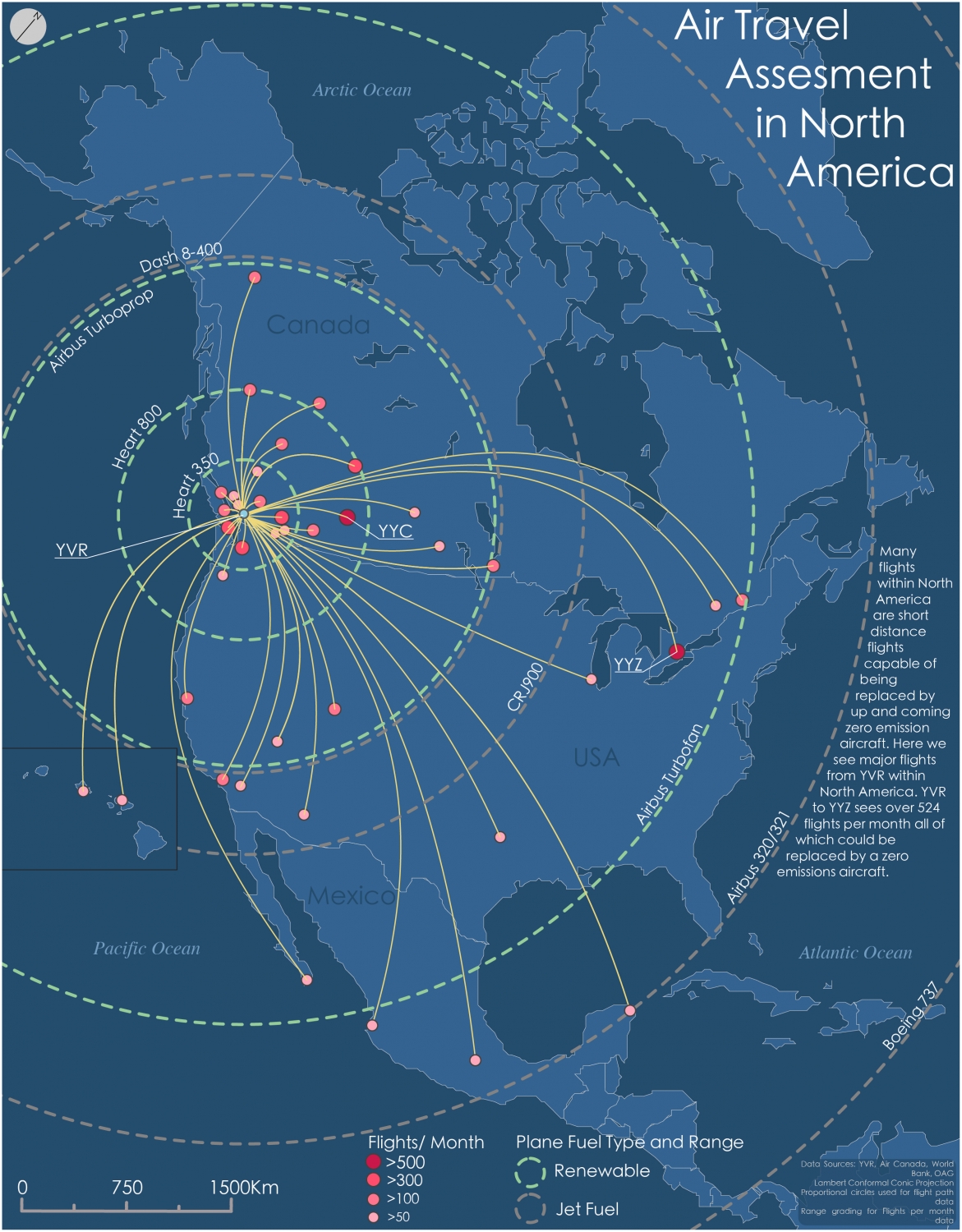
- Diego Lozano – Air Travel Assessment in North America
- Cathy Niu – Toronto Fire Incidents
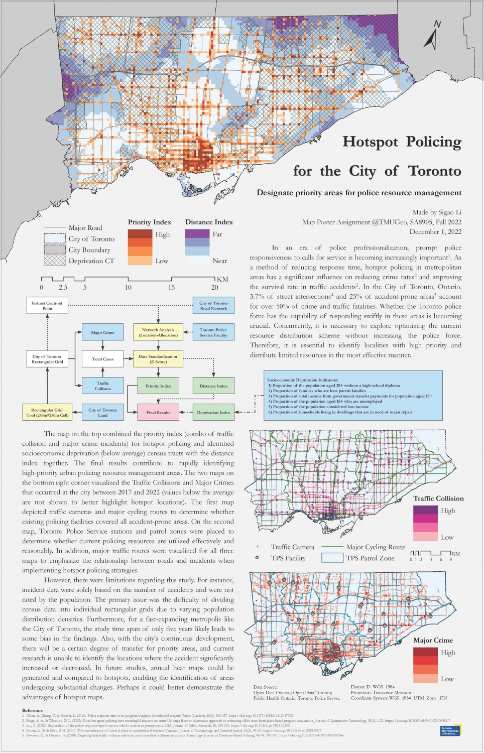
- Sigao Li – Hotspot Policing for the City of Toronto
- Yuyang Ding – Environmental Justice in the City of Vancouver: Street Trees, Income, and Demographics by Neighbourhood
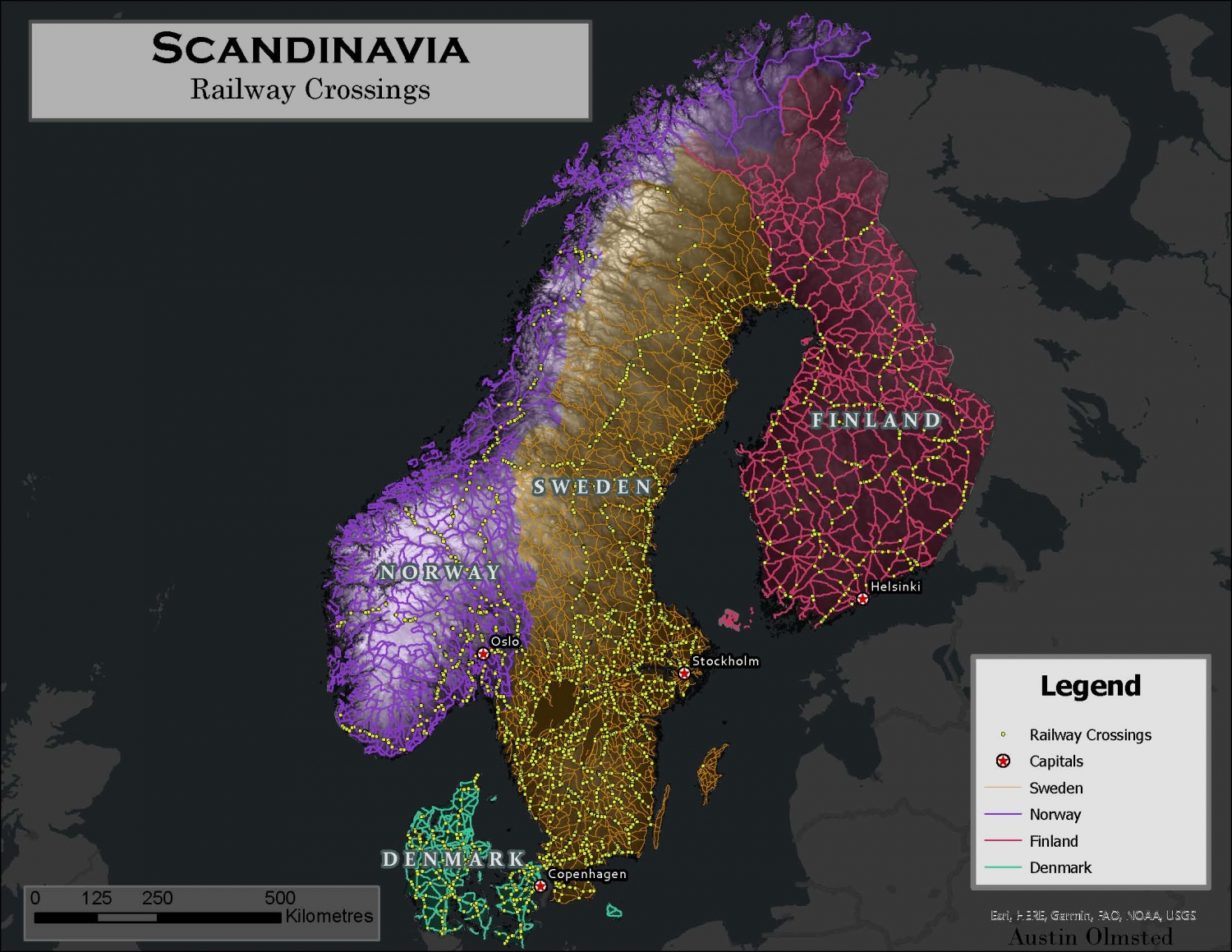
- Austin Olmsted – Scandinavia: Railway Crossings
2023 Student Mapping Competition Entries: President’s Prize (University Level Entries)
Scandinavia: Railway Crossings
Austin Olmsted, UNBC
Design Objectives:
Scandinavia was chosen due to my heritage from Denmark. I decided to map all railway crossings due to the number of trains and how they may impact driving in Scandinavia. This map could be used alongside future analyses such as car-train collisions or train caused delays.
In order to obtain the railway crossings, I had to intersect the road and rail layer from each country. I used simple yellow points to convey their importance and a better choice regarding the cluttering of points e.g in Sweden. The roads were thinned enough to show the DEM behind and each country’s background colour.
I separated the countries with light and distinct colours that lack a true border. This was done to not clutter the map with additional lines that could conflict with the roads. The roads are coloured by country, and their colours match their country’s glowing hue. The dark gray base map made the colours of the countries more appealing by contrast.
For extra information and context to the roads and railway crossings, I added an elevation layer and capital cities. The lesser number of roads and crossings were correlated with higher elevations. The capital cities show a dense area of crossings and compare with more rural areas. The DEM was obtained and parsed from Copernicus, the European Union’s land monitoring service. The external polygons for each country were extracted from Esri via the ArcGIS hub. Finally, the roads and railroads were sourced from “DIVA-GIS” where generic country data can be freely downloaded.
Environmental Justice in the City of Vancouver: Street Trees, Income, and Demographics by Neighbourhood
Yuyang Ding, University of British Columbia
Design Objectives:
In 1990, the so-called “father of environmental justice” Dr. Robert Bullard published a paper titled People-of-Color Environmentalism, in which he mentioned that a sustainable city is presented by the “three Es” – Environment, Economy, and Equity, and these indicators will enhance altogether rather than undermined in the long term. However, the reality is that equity, compared with the other two, is often least represented.
This is exemplified by many cases in the US in the 1980s where vulnerable communities (e.g., people of color & working class) suffered from environmental injustices, and they challenge the decision-maker against the location of toxic wastes, landfills, and garbage incinerators near their neighbourhoods.
This project is inspired by the idea of the paper that cities should pay more attention to equity while they become environmentally and economically sustainable. Vancouver published the Greenest City Action Plan (GCAP) a decade ago, aiming to build the city a greener place to live, work, and play. GCAP listed 10 goals and many targets around a better environment and green economy. However, surprisingly, in the 90 pages document, the word “equity” only appears twice. It is worth worrying if Vancouver, as one of the greenest cities in the world with a strong economy, neglects the equity among its diverse population.
The project collects three types of data from the City of Vancouver Open Data Portal to represent the three Es, street trees (Environment), median household income (Economy), and demographics by neighbourhoods (Equity), seeking the relationship between the three to reveal whether there exists environmental injustice in the city.
Hotspot Policing for the City of Toronto
Sigao Li, Toronto Metropolitan University
Design Objectives:
This map poster focuses on how the hotspot map can help to reduce police response time, improve the efficiency of police patrols by detecting high-crime areas, and provide potential transportation infrastructure or regulation improvements by locating high-incident-prone areas.
Cartographic Design: The poster will include a workflow for the methodology of this study, one hotspot major crime map, one hotspot traffic collision map, and one hotspot policing map created by combining the two datasets.
Implementation: The main component of the poster is a 250m by 250m rectangular grid covering the city of Toronto. The point data of Major Crime and Traffic Collision are assigned to these grids, then normalized using the method of Z-Score. Finally, the results are visualized on the maps. Road networks, cycling routes, traffic cameras, police facilities, patrol zones, and social deprivation index will be assigned to the appropriate map.
Possible Uses: The application of hot spot policing in urban areas has a significant effect on reducing the crime rate, and the police dispatching due to preventive patrols in hot crime areas will not significantly divert the crime space (Weisburd et al., 2017; Telep & Hibdon, 2018). In terms of traffic, installing traffic cameras in high-accident areas can significantly reduce traffic collisions, and the response time of police to traffic collisions is positively correlated with the survival of the accident party (Martinez-Ruiz et al., 2019; Liu, 2022).
Limitations: The Major Crime and Traffic Collisions data are selected from 2017 to 2022. While presenting 5-year overall crime/collision hotspots can provide Toronto police concerning priority patrols, data changes every year. Future research could create a yearly heat map and compare the hotspots, and perhaps it could detect areas with increased rates.
Toronto Fire Incidents
Cathy Niu, Toronto Metropolitan University
Design Objectives:
The purpose of the map poster is to show the spatial and temporal distribution of fire incidents in Toronto and to explore the relationship between fire risk and populations or locations. This message is aimed at the general public as well as Toronto Fire Services (TFS).
The poster was designed with the assistance of ArcGIS Pro, Python Jupyter Notebook, and Adobe Illustrator. ArcGIS Pro was used to produce all thematic maps, while Matplotlib and Seaborn in Python Jupyter Notebook were utilized to generate the charts. Then, Adobe Illustrator was applied to assemble all elements and create the final output.
The main map (Severe Fire Incidents) was placed in the center of the poster, and all the other components were constructed to surround it. The top part of the poster presents an overview of the distribution of fire incidents, including the rate of fire incidents, the number of people rescued, and the time of fire incidents.
The bottom map displays the speed and resources with which the Fire Services responded to the incident. Python’s statistical analysis (pie chart and bar charts) of the datasets is also displayed on the poster. A major design guide was the color coordination within and between maps and surrounding elements of the poster.
Air Travel Assessment in North America
Diego Lozano, University of British Columbia
Design Objectives: The goal of this map was to communicate in a simple and effective manner the potential for reimagining air travel.
Today most flight are short haul flights. Canada and the United States serve as effective example where distances are on the longer end of what one could classify as a short haul flight. In the next few years net zero emissions aircraft will become available for short haul flights paving the way to replace jet fuel aircraft in a world where flights are in high demand.
In order to communicate this information clearly aircraft ranges where mapped as radii where the color represents the fuel type, using green as renewable fuel source as it is commonly associated with “environmentally friendly” aspects. Grey represents the alternative, non-renewable fuel source. In order to communicate the potential these new aircraft had an example airport was chosen wherein the radii were centered, in this case YVR International Airport.
The 20 most frequented destination from YVR were mapped as just a small example of the volume of flights that could be replaced. Symbols for destinations are proportional circles based on number of flights and are color graded to help distinguish them further from other categories. Line weights on flight path were kept minimal in order to not overshadow the radii.
Text was kept minimal throughout; in addition to a short informative text, labels were only placed major Canadian airports, countries, waterbodies and plane radii in order to not over crowd the map. Color were also chosen to be easy on the eyes for viewers while not compromising on the contrast needed to communicate effectively. In essence this map and all the design choices made were meant to communicate the potential net-zero emission aircraft have to replace jet fuel aircraft by just beginning to highlight the quantity of flights and by comparing net-zero aircraft to jet fuel aircraft in the simplest manner possible.

Overview of the 2020 Taal Volcano Eruption
Johnson Lumague, Toronto Metropolitan University
Design Objectives:
The intended topic for this map poster will be to provide an overview of the 2022 Taal Volcano eruption in the Philippines which will examine the area of the volcano, the effects the eruption had on its surroundings, and the population density of the province the volcano is located in (Batangas, Philippines).
Data: The data will consist of 2020 vector and raster data of the Taal Volcano as well as the administrative boundaries and census statistics of Batangas. The vector data will be retrieved from the Philippine Statistic Authority and the Philippines National Mapping and Resource Information Authority which will consist of the provincial boundaries, the municipality/city boundaries, and census data. The raster data will be retrieved from USGS EarthExplorer which will consist of Sentinel-2 remote sensed imagery of before and after the eruption of Taal volcano.
Cartographic Design: Three different maps will be created which will show a different aspect of Taal Volcano. The first map will show the main location of Taal Volcano and its surroundings as well as three different buffer danger zones around the volcano. The second map will show the vegetation levels of the main crater before and after the eruption. The third map will show the population density of Batangas as well as the location of its municipalities and cities.
Implementation: The first map will consist of polygons and line data which will show the volcano (the main crater and the caldera) as well as different land covers (land, water, roads, and built-up areas). Additionally, three buffers will be created around the volcano to show the danger zones (5 km, 10 km, and 15 km). The second map will consist of two raster images which show the vegetation levels through the calculation of the main craters NDVI (normalized difference vegetation index) which ranges from dense vegetation to no vegetation to water.
The classification system will be symbolized through a stretch colour ramp from green to red. Additionally, two inset maps will be included to show the area within the main crater as well. The third map will be a choropleth map of the population density per square kilometre which will use a natural breaks classification system with 5 classes. This creates the groups based on distinct breaks in the data. Additionally, point data of the urban cores within the province will be shown as well as the provinces neighboring Batangas.


